In 2010, mobile communication in India was still dominated by traditional SMS services. While there were websites that allowed users to send free SMS, the experience was far from seamless. These web platforms were primarily desktop-based, lacked mobile optimisation, and required users to manually enter CAPTCHA codes, making the experience tedious. This opened up an opportunity to rethink how users could send free SMS in a more user-friendly way—through a mobile app that was always accessible and provided more convenience.
The growing penetration of smartphones in India made the mobile-first strategy compelling. We hypothesised that users would prefer an app for free messaging, which would encourage frequent usage due to its on-the-go convenience.
Task:
Our objective was clear—create and validate a solution that would let users send free SMS through a mobile app, offering a better user experience than existing websites. We needed to build an MVP (Minimum Viable Product) and ensure that our solution addressed users’ pain points effectively. To do this, we had to:
– Identify the key differentiators between a mobile app and existing web solutions.
– Analyse the competition.
– Develop the core product functionalities.
– Gather feedback from early adopters to validate the idea.
Action:
1. Brainstorming and Ideation:
– We began by discussing the challenges users faced when using web-based SMS platforms: poor usability, slow performance, and the inconvenience of accessing a website every time they needed to send a message.
– During brainstorming sessions, we prioritised ease of use and accessibility. Our guiding question was: How can we make sending SMS as quick and seamless as possible, right from users’ mobile phones?
– Our hypothesis was that a mobile app would offer a level of convenience unmatched by web solutions, and that would drive frequent engagement.
2. Competitive and Market Analysis:
– We analysed the existing free SMS websites like Way2SMS and 160by2. These platforms had a decent user base but suffered from a lack of mobile-first design. They also had ads that cluttered the experience, and some even had daily SMS limits or required users to view ads before sending a message.
– We conducted a SWOT analysis (Strengths, Weaknesses, Opportunities, Threats) to evaluate both our app concept and the competitors’ offerings. Our analysis revealed an opportunity to provide users with an ad-light, frictionless mobile app experience that websites couldn’t deliver.
3. Deciding on a Mobile-First Approach:
– Based on our analysis, we decided to prioritise building a mobile app over a web solution. Our core hypothesis was that an app would not only increase user convenience but also encourage higher frequency of use. Users would be more likely to send multiple SMS messages throughout the day if the process was fast, mobile, and didn’t require logging in each time.
– This decision also aligned with the growth of smartphones in India, which was an emerging trend at the time.
4. Leveraging Our Unfair Advantage:
– One of the key factors in keeping JustSMS sustainable was our access to SMS at the lowest possible cost. As an SMTP reseller for SMS API services, we had a major cost advantage over competitors who faced higher operational expenses. This gave us the ability to offer free SMS to users without worrying about prohibitive costs.
– This competitive edge was pivotal in making the product viable from day one.
5. Building the MVP:
– We opted for a lean development strategy, focusing on core features that would solve the problem directly: sending free SMS with minimal user input. The app was built to be lightweight, fast, and user-friendly.
– We focused on reducing the number of steps needed to send an SMS. Unlike web platforms that had multiple barriers (logins, CAPTCHAs, pop-up ads), our app made sending a message as simple as a few taps.
– The MVP was designed to test user behaviour and validate the hypothesis that convenience would drive higher engagement.
6. Testing and Feedback:
– We released the MVP to a small group of users, gathering insights on their experience. The feedback was overwhelmingly positive—users loved the fact that they could send SMS without the hassle of using a desktop or dealing with cluttered websites.
– This early feedback validated our hypothesis and informed further improvements. For example, users wanted the ability to store frequently contacted numbers within the app, which we integrated in future versions.
Result:
The MVP gained immediate traction among early adopters, proving that our decision to focus on a mobile-first approach was the right one. The convenience of the app encouraged users to send multiple SMS messages daily, resulting in much higher engagement than we had initially anticipated.
Within the first few months, we started seeing an exponential increase in downloads and active users, marking the success of our hypothesis. The product quickly positioned itself as India’s first free messaging mobile app, setting the foundation for further growth and innovation.
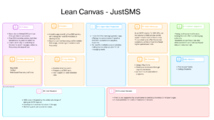
We didn’t have Lean canvas at the time of doing this but have tried to put together thoughts about how we would have done it.


